Billy Apple (USA/NZ) – Frank Badur (DE) – Ronald de Bloeme (NL) –
Wernher Bouwens (NL) – Nuria Fuster (ES) – Daan van Golden (NL) –
Hermann Glöckner (DE) – Joachim Grommek (DE) – JCJ van der Heyden (NL) –
Olaf Holzapfel (DE) – Callum Innes (GB) – Andrey Klassen (RUS) – Yayoi
Kusama (JP) – Tad Mike (USA) – Judy Millar (NZ) – Thomas Müller (DE) –
Hester Oerlemans (NL) – Ragna Robertsdottir (IS) – Han Schuil (NL) –
Ben Sleeuwenhoek (NL)
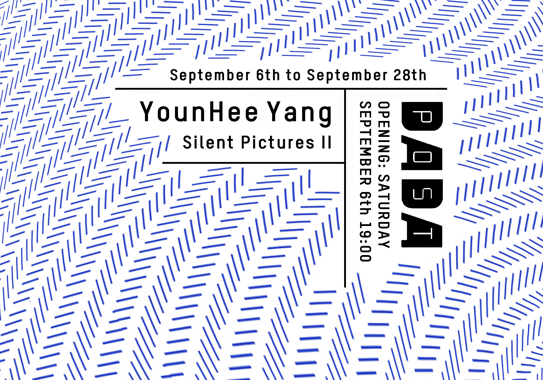
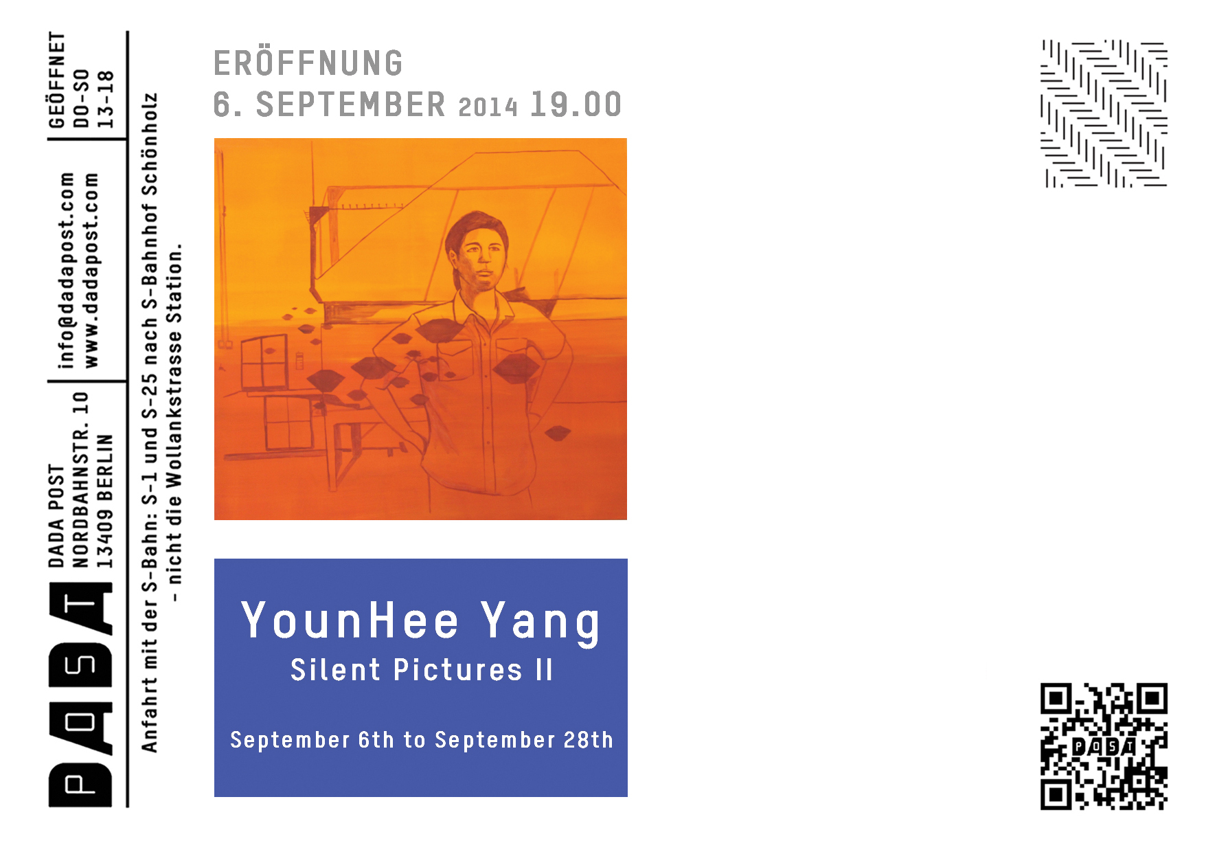
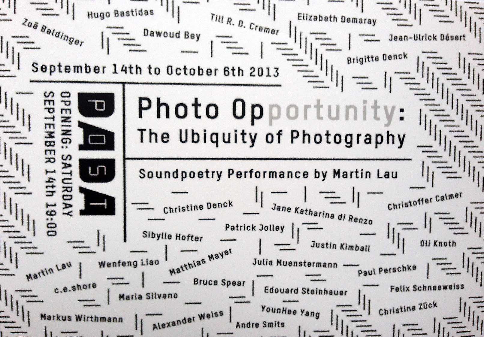
OPENING: FRIDAY, 17th FEBRUARY , 6 pm
EXHIBITION: 17th FEBRUARY 24th MARCH 2012
Red protects itself. No colour is as territorial as red. It stakes a claim, it is on the alert against the spectrum. (Derek Jarman)
Seeing Red is Hamish Morrison
Galeries final exhibition in its rooms in the Heidestrasse. We are
delighted to present on this occasion a group exhibition on the theme
of the colour red in art.
From its outset, in addition to working with a stable circle of
artists, Hamish Morrison Galerie has always sought to introduce to its
audience artists who have rarely, if ever, exhibited in Berlin. For Seeing Red, the gallery has succeeded in this once again, bringing to Berlin the works of artists such as the important Dutch painters Daan van Golden and JCJ van der Heyden, as well as the pop conceptual artist Billy Apple, whose debut show in 1963 in London coincidentally was entitled Apple Sees Red.
Red is said to be the first colour to which humans gave a name, the oldest colour designation in the worlds languages. There is even the theory that hundreds of years ago, it may have been the only colour the human eye could perceive. That may have been due to the red colour of blood, or the necessity to distinguish ripe from unripe fruit. However it may be, the colour red was used very early on for cultic purposes, and since time immemorial has had an almost magical effect attributed to it.
Adam could not resist the red apple, Esau wanted to eat the red
meal, Parsifal fought for a red suit of armour. Karen risked her soul
for the red shoes, the wolf lusted after the girl with the red riding
hood. And it was a red hood on a red raincoat which Donald Sutherland
followed in the unforgettable film Dont Look Now, and which
lured him to his horrible bloody death. There are countless stories
that could serve as examples for the fatal fascination the colour red
can exude.
For a long time, especially in European culture, wearing red clothes
was reserved for the rich and powerful. Whatever powers have been
ascribed to the colour red in the cultural history of humanity, its
meaning in various cultures has ranged from wealth, happiness,
femininity and strength all the way through to grief in some African
countries. They are almost exclusively unambiguous and axiomatic
positions. Red does not seem to tolerate any objections, neither in a
positive nor a negative sense, neither in cold nor in warm
temperatures.
In Christian art of the Middle Ages, red was the colour of
martyrdom, of Christs sufferings, and thus reserved for the depiction
of Biblical scenes, dignitaries of the Church and the aristocracy, but
it was also the colour of wickedness and sin. Martyrdom and sin are the
two red poles of the world of medieval Europe.
The newly powerful and wealthy bourgeoisie of the Renaissance was eager
to underline its claim to equality with the aristocracy, and was
portrayed frequently wearing red clothes. With the growing independence
of artists from their patrons, the use of colours became more
individualized. The use of shades of red initially imitated those
shades actually found in the chosen motif. Matisse finally spoke of a
colours very own beauty that should be preserved, just as in music
timbre should be preserved. He was convinced that colour exists in
and of itself, and elsewhere he said, Ive used colour to express an
emotion.
For Kandinsky, form can exist independently, but not colour. Colour cannot be spread boundlessly. We can only imagine or see a boundless red in the mind. … But when red needs to be given a material form (such as in painting), then it must firstly have a particular shade from the endless series of different reds, and secondly be limited by the surface of the painting. Kandinsky maintained that the value and character of certain colours are emphasised by certain shapes, and he assigned red to the shape of the square.
If there were only one truth, we would not keep having to create new images all the time. What Picasso says about truth seems to also apply to the effect and role of colour in art as a whole, and thus also to the colour red. Whether we let ourselves be captured by the shades of red in a painting by Frank Badur, inspired by his numerous trips to Asia, or expose ourselves to the intense red on a huge painting by Ronald de Bloeme, whether we ponder the changes red is subjected to as soon as it is confronted with black, as in the large-format paintings by Judy Millar, or engage with the existential roots of the red-and-white Polka Dots by the Japanese artist Yayoi Kusama, the impressions and associations of the colour red remain fascinatingly complex and mysterious.
The exhibition Seeing Red
now invites to make our own observations. All of the works shown use
the colour red. The beholder is here given the rare opportunity to
reflect on a colour in art about which so much has been said already,
but which nonetheless carefully guards the secret of its fascination.
Only one thing can be said with absolute certainty: it doesnt leave
anybody cold.
Location:
Hamish Morrison Galerie
Heidestrasse 46-52
10557 Berlin, Germany